Your brand fonts can completely change the overall vibe and aesthetic of your brand identity design. For non-designers, fonts can be a tricky thing to get right. I often see fonts being used incorrectly, which makes designs look unprofessional and low quality. As a business owner, it is so critical to creating a good and reputable impression amongst your target market, and your brand design plays a huge role in that!
Here is a step-by-step guide to (properly) choose your brand fonts!
Types of Fonts:
Before you start choosing your brand fonts, it’s important to understand the different types of fonts and the purpose they serve.
There are four main types of fonts: Serif, Sans Serif, Slab Serif, and Display.
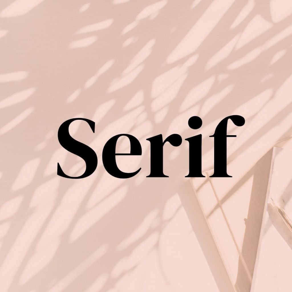
Serif fonts are characterized by small lines, called serifs, that finish off the end of a letter. They are often used in body text and for materials that require a traditional aesthetic and tend to be an easier font to read at a smaller size than the sans serif fonts.
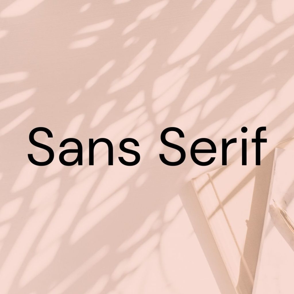
Sans serif fonts have clean lines and no fancy serifs or other embellishments. They appear much sleeker and more modern than the more traditional Serif fonts.
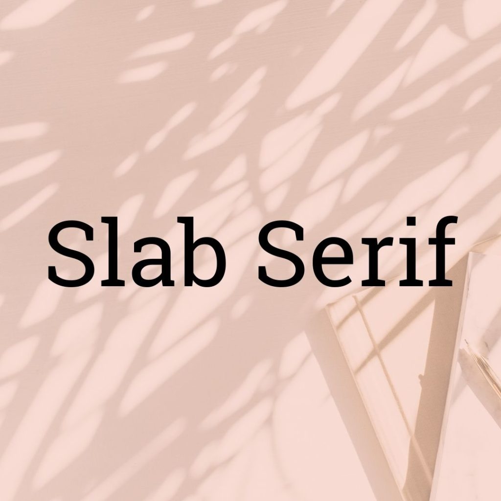
Slab serif fonts are a kind of serif font with added thickness, weight, and width at the end of each stroke. This type of font is used when there needs to be an emphasis on the text’s weight or when it needs to be very legible at small sizes such as in headings or captions.
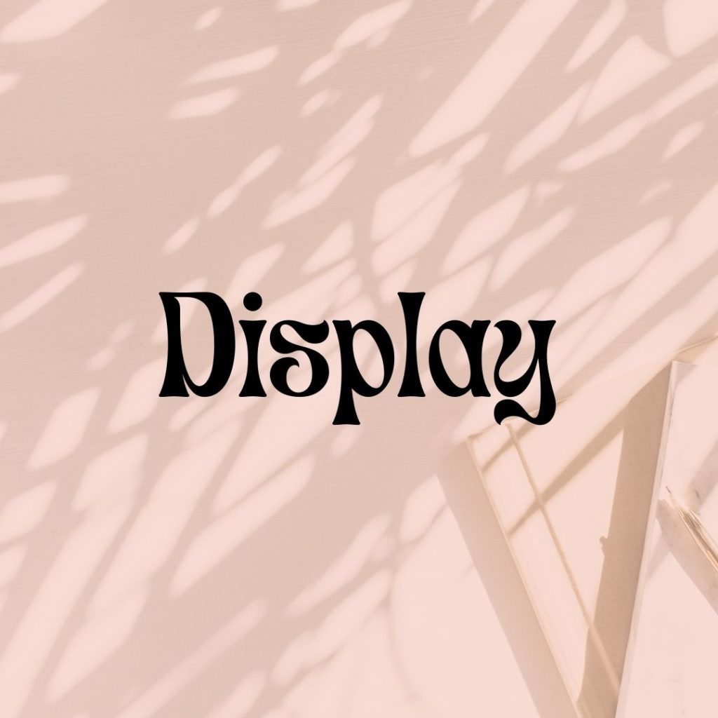
Display fonts have heavy strokes and exaggerated shapes to provide emphasis. They tend to be used for headlines or large text that needs to be more visually attention-grabbing.
Font Family
Two of the biggest font mistakes I see are when entrepreneurs either use too many different fonts or are constantly changing up the fonts they use in their designs. It’s vital to continuously use the same select fonts in order to maintain brand recognition and to keep your branding clean and professional. That’s where the importance of having a set font family comes into play.
A font family consists of 3-4 fonts: Title, subtitle, and body. Some brands will also include a display font in their font family, such as a script font, for decorative purposes.
Here is a quick overview of each font that makes up a font family:
- Title font
- Used for headlines
- Must be legible – avoid using overly decorative display fonts as title fonts
- Should be eye-catching
- Subtitle font
- Typically sans serif & all caps
- Body font
- Used for all body copy
- Display font (optional)
- Used sparingly for decorative purposes
Your font choices should reflect your brand personality
Having a brand strategy behind your brand identity is so important in order to effectively create emotional bonds with your target market. The importance of typography is often overlooked when creating a brand identity, as most entrepreneurs who DIY their branding tend to just choose fonts they find “cute”, instead of doing deep dive into finding fonts that will help embody their brand personality and their target market.
Here’s a quick overview of the vibe certain fonts will help create for your brand:
- Serif = classic, editorial, vintage
- Sans serif = modern, sleek, innovative
- Bold = Loud, edgy, In your face
- Thin = minimalistic, elegant, muted
Style your fonts
Properly styling your fonts is another vital part to curating your font family, and again is nearly always overlooked by non-designers who DIY their own brands.
Here are a few things to keep in mind when styling your fonts?
- Will you use all caps, all lowercase, or normal caps?
- Will you adjust the spacing between your characters? (referred to as tracking in the design world). I suggest only increasing tracking if you are using all uppercase letters. I typically do this for subtitle fonts.
- Will you adjust the line spacing?
Pro tips for choosing fonts
If you feel confident enough to properly put together your own font family, I’ll leave you with a few pro tips to keep in mind when cultivating your font family for your brand:
- Use script font minimally, or none at all.
- Script fonts are a type of display font, meaning they should be used only for decorative purposes. Do NOT ever use script fonts for titles, and please, never, ever use a script in all caps.
- Avoid using overly-used fonts.
- Using popular fonts will make your brand look like everyone else’. While it may be tempting to choose the aesthetic fonts at the top of the “most popular” list on Creative market, it’s best to steer clear and take the time to look for high quality, less-used fonts.
- Invest in good fonts.
- Not all fonts are created equal. Fonts can be super expensive, and to a non-designer, some of the prices might seem outrageous. Remember that this is an investment in your brand and high-quality fonts will increase the value of your brand and will ultimately look more professional. You don’t have to invest in an entire font family, but I suggest purchasing a regular and italic version of your font
Where to purchase fonts
Here are some of my favorite font resources I use for my design clients:
- Fonts.com
- Myfonts.com
- Creative market
- From direct founders (such as House industries, Monotype, etc.)
At the end of the day, a lot of time, experience, and expertise come into properly cultivating a font family. If you are ready to invest in the next-level version of your brand, I invite you to apply for my custom brand design. Click here to apply for branding!
How to Choose Your Brand Fonts Like a Pro
January 9, 2022
Leave a Reply Cancel reply
LET'S CONNECT
COACHING
PROGRAMS
ABOUT
BLOG
SERVICES
CONTACT
WEBSITE DESIGNED BY KERRY IRELAND CREATIVE STUDIO
Kerry Ireland Creative Studio
Kerry Ireland is a Web & Brand Designer based out of Maryland. Her mission is to help entrepreneurs across the globe exponentially expand their brand and business so they can live the ultimate freedom-based lifestyle.